The Secret Life of Buildings – “Home”

Back Scroll To Media

The Secret Life of Buildings – “Home”

Sam Hill

1st August 2011

An interesting enough quest-u-mentary into improving housing standards in the UK, the first part of The Secret Life of Buildings takes about half an hour to get interesting, from an experiential viewpoint. Unless you’re happy to sit through some fairly contrived experiments to “prove” that 1) lack of sunlight is unhealthy, 2) people are unhappy living in cramped spaces, 3) the golden ratio looks nice.

However from the mid-point onwards the researchers pull up a couple of nice case studies.

The first is a West London drop-in centre for cancer victims, Maggies.

The architects responsible made tactful decisions on materials to give a homely feel that “inspires, relaxes and stimulates” – using inexpensive softwoods, strong colours and polished concrete to create an environment with a warmth that stands apart from the “stark, alienating spaces”, sterility and cheap plastic nature of hospitals and surgeries. The effect this environment has upon the people that use it makes some compelling further arguments for the commonsensical but often forgotten psychology of materials theory outlined by D. Norman[1] – that the appearance, finish and textures chosen for a designed object or space will affect how people feel whilst using it. This is a very good environment, in other words, to temper a bad experience.

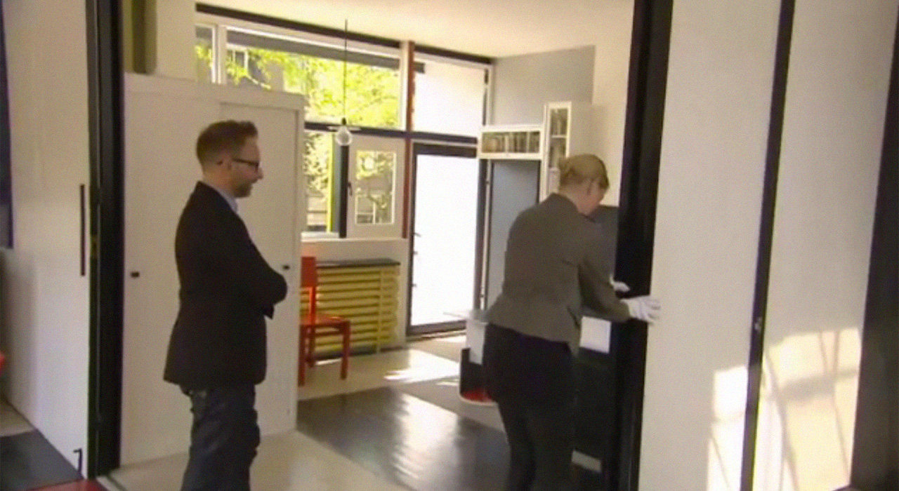
The other relevant case study is the 1920’s Rietveld Schröderhuis, a playful Mondrian-esque structure that avoids fixed corners and has flexible internal walls for re-defining spaces through-out the day (open plan in the morning, enclosed in the evening). The mood of the house can therefore be changed enormously according to the needs of the people within it. An attribute, the programme notes, that most UK housing is lacking enormously.

The series has a further two parts – one relating to work spaces and one to leisure buildings. The third episode, likely to be aired 8pm August 15th should be considered a must-see.

[EDIT:

The third part of the series is largely criticized the corporate-funded, superstar-architect-designed pavilions, galleries and museums that have more going on the outside than the inside. I’d agree that public spaces should show more consideration for the way they’re used, and be designed to be more engaging than passively observed. However, I’d disagree with the implication that buildings can either be impressive but alienating, or “undesigned” and engaging; that we only feel comfortable in spaces is if we can imprint our own identity on them. I see no reason why a structure, or any other piece of design, cannot simultaneously be sensationally stimulating and conducive to engagement.]

[1] Norman, D (2002). The Design of everyday Things. USA: basic books. p9.


Alex: A Life Fast Forward

Back Scroll To Media

Alex: A Life Fast Forward

Sam Hill

26th July 2011

Alex: A Life Fast Forward is a documentary about Alex Lewis and what he did after being diagnosed with terminal cancer. The synopsis is as follows:

Alex Lewis knows he does not have much longer to live. Aged 21 he finds himself falling hopelessly in love and can’t quite believe what’s happening.

Alex was first diagnosed with bone cancer shortly before his 18th birthday. After over three years of intensive treatment, he realises he is running out of options. He decides to cram as much life as possible into the time he has left. His remarkable zest for life is contagious.

But this wasn’t the “bucket-list” extravaganza I was expecting from the trailer – three years of globe trotting, dune buggies, parties, falconry, sports cars, romance and adventure compressed into 60 minutes; a  bitter-sweet roller-coaster ride with a Carpe diem message. No. Inevitably, it was actually an account of a very young man with an aggressive, painful and debilitating disease, spending his remaining time at home, with friends and family.

Instead the documentary focused on the term ‘Gezellig’.

The word came to mean a great deal to Alex and he used it to describe his desired state of mind. The Wikipedia description is as follows:

Gezelligheid is a Dutch abstract noun (adjective form gezellig) which, depending on context, can be translated as convivial, cosy, fun, quaint, or nice atmosphere, but can also connote belonging, time spent with loved ones, the fact of seeing a friend after a long absence, or general togetherness. The word is considered to be an example of untranslatability, and is one of the hardest words to translate to English. Some consider the word to encompass the heart of Dutch culture.

Many other European languages seem to have a similar term (Gemütlichkeit, hyggelig, etc.) but there is no real parallel in English (‘Cosy’ probably comes closest). It seems odd that without knowing an equivalent word, such a concept is so easily recognisable. The description is reminiscent of family holidays as a child; an emotional cocktail that creates something unique. It is a significant and powerful idea.

Interestingly, the experiential value of gezellig is grounded in emotional satisfaction, not sensational exploration like so many other ideas we focus on at PAN. The fact that this raises many questions on the relative values of contentment versus ambition shouldn’t be ignored. Alex understood the great emotional depth of this concept and was able to master it.

Other interesting questions from a creative perspective arise. How can design augment gezellig? Or generate it in absence? Answers could take Alex’s example and use it to improve the experiential wealth of other people’s lives.